I have decided to look through some designers current websites to see what type of information to include and also the gather inspiration and ideas.
Analogue
This site uses photography as the background, I think this is a good idea as it puts a lot of focus on the designs themselves, although I feel that it is also quite full on and could be distracting. If I was to create something like this I would have to consider how the navigation would appear with it and what colour it would be to sure that it din't become camouflaged. I like how the projects have been displayed as thumbnails and the filter tool dims the items that aren't within the chosen category. The large scale slide show allows you to see the images very clearly and in a lot of detail.


3 fish in a tree
This website had a very different approach and unlike the previous example you had to scroll to see a lot of the content. The home screen had a lot of different boxes highlighting different aspects. The projects are also displayed with thumbnails and once clicked on give a short description that will be helpful for the audience. I also like the bright colours used as it gives a playful feel and gives the audience a feel of what the company is about.


Bibliotheque Design
This website has a very limited colour palette, this means the colour of the work always fits and doesn't clash. Thumbnails are definitely a common theme for showing samples of work to be viewed further. I think this simplistic approach is very clear to view and understand but it also doesn't provide a personality for the brand and it is harder to get a feel for their style.


To the Point
I feel the black background of this website is very intense, especially with the contrast of the type. It definitely isn't a style I'd pick for my own designs. The font is also very bold which adds to the look, I think this is a distracting aspect. Even though I don't like the design the content it still good and covers all the necessary areas.


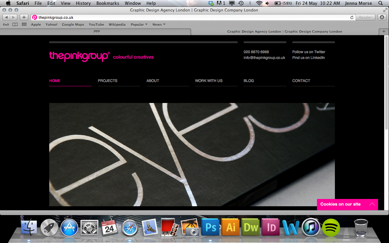
The Pink Group
I like how this website makes an immediate link with the brand through the use of the colour pink. The navigation and the rest of the layout is also very slick and the pages are easy to go through and it is quick to get to a subject of interest. The images used are also a really high quality and show the work very well.


No comments:
Post a Comment