I decided a good start to branding myself would be to create a logo inspired by my initials. I found hand drawing to be really useful as it was quick and easy to get my ideas onto paper, it would have been a lot more time consuming to do this stage digitally. I found that the letters J and M worked well together and there was a lot of options to explore, I was surprised by the number of different styles I was able to create. Some I definitely didn't like but I felt that there was a lot I could have taken forward.

I felt that it would be the best option to go with something that would be simple to create and work successfully with a variety of other aspects, although I was also very fond of the handwritten styles. I found it was easy to recreate the designs I liked because I had a drawing to work from as it really sped up the process. After drawing out my two chosen options and experimenting with different things I decided to combine them. I liked the structure of the first an the smooth curves of the second, both styles fitted easily together.


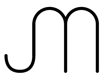
Once I had got the developed design I experimented with adding a design, continuing with the same style to represent 'design'. Although I felt this was to much and the overall look was less successful. I also worked with adding type but I think it works better without. I will only include the text in necessary situations.


No comments:
Post a Comment