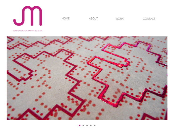
After starting my research on current graphic design studio websites I have started work on my own. I began by adding my logo and experimenting with the placement and appearance of my navigation, initially I had a vertical list but I felt it worked better aesthetically having it horizontal. I also altered the colour of the type from pink to grey as it looked more subtle and made the logo stand out more.


From the other sites I looked at I liked it when there was a large scale image of some work on the home screen, rather than a lot of text as I felt it had more impact and engaged the audience straight away. Rather than having a single image I thought it would be a good idea to have a slideshow so that multiple images could be viewed, so I altered the layout so that it would include a navigation for this. I used dots as I liked the simple appearance and it also reflected the round fluid shapes of my logo, I experimented with scale and colour so it became a subtle aspect of the composition.


I have decided to add a title underneath my logo, as it occurred to me that initially people will not be familiar with my logo so a description would be needed. After making this slight change I applied other images into the layout that would be included in the slide show. I have included the main aspects from the my favourite briefs I have completed to give a brief feel of my work.


To experiment further with my slideshow images I adapted the style slightly to get a different look, rather than showing the products individually I have focussed more strongly on the bring themselves to create a block image. In some cases I think this way works more strongly but with others I prefer the previous look, so I may use an amalgamation of both.


To add a rollover link I have made corresponding images the same size as the circles, that when hovered over will appear. I think having the images viewed individually like this is a lot better than all at once because they are a lot easier to focus on and don't clash or contrast with anything else.


I then started creating the pages with the individual projects I have done across this year. I wanted to carry on the theme of the slide show look as I feel the large scale images are very effective and I also didn't want the user to have to scroll down. I carried on the layout of the previous page and placed the images on the right hand side, this meant there was space on the left to write the name of the project and also a short description summarising the brief and concept. I used images that I felt showed the project in the best light and once I had completed the first I applied the same design to the rest of my work.


To finish off I created some simple pages stating my email address and on the other some basic information about me.


No comments:
Post a Comment