I love the simple colour scheme chosen for this project as the charcoal grey and bright yellow really compliment each other. I think this theme also makes the work stand out as quite often white would be included as a main colour. The overall design is very simple, but because of the colour palette it has been brought to life. I think this is something very important to consider.


Vivi Feng
The logo of this branding has a creative twist and I think this is an aspect that would make it memorable to the people viewing it. The bright, neon appearance of the turquoise is also very engaging, especially with the contrast of the crisp white. I like how the branding has been covered very accurately across the whole range of products that creates a strong body of work.


Rebecca Liggins
What drew me to this project was the interesting concertina format as it would be more unusual to interact with. It also gives a clever way to lay out work, using one side for designs and the other for more written information. The lime green works well, especially printed onto the cover on textured stock and also as a block colour on the reverse.


Simon Langlois
I like how this designer has experimented with including different paper sizes within this publication as it creates a very interactive piece of work. I think it is cleaver how folding over the cover reveals the coloured stock underneath, that can also be turned over to show to separate sheets. Also by having the small column pages allow writing to be applied on them leaving space on the corresponding pages for full images.


Keith Rodri
This is extremely creative self promotional work. The creation of a character is very clever and it is even better how the idea has been applied to the aspects surrounding it. For example the belly band is very clever as rather than it being distracting it has been incorporated to the design. This is also related to the business card and how it interacts with the holder. Having a box is also a unique touch and something different from the norm.


Pat Schlaic
The structure and contents of this pack is quite basic but it is the concept that make it stand out and be interesting to the audience. The use of the hand and the writing on it is unusual and a quirky way to get information across. I also like how the hand has been developed to also appear to be holding the business card.


Ewelina Rosinska
I like how this work has a slightly feminine look to it by incorporating the ribbons, the colour of them works well with the grey stock to still give a strongly designed look. I like how the portfolio carries on the theme of the branding and I like how some pages include a simple turquoise pattern. The cv that has been done in an infographic style also gives a very visual look, that is easy to interact with and get information from.


Sarah Neville
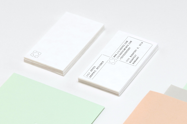
I think the format of this project is really interesting as how the main page folds out to reveal the bright turquoise and the work inside is great. I think the cover letter is very engaging and grabs your attention as you unfold the pack. I also like the simplistic, contemporary look of the logo as I like how the lines interact and create an interesting shape made by the letter forms. On the base of the pack is also where the business card and pdf cv is stored, I think this is a clever idea.


Lili Koves
This set of pieces does not have one main colour, but still works successfully as a body of work because of the similar tone across the pastel colours used. I think this is good as it creates a slight variation across the project but whilst still retaining a constant design theme. I'm not sure on the logo as I feel there is too much going and too much written text.


Marcko Vuleta-Djukanov
This designer has branded a very large range of items, which I think shows how strong the design is as it can be successfully applied to a big variety whilst retaining a constant look. Not really sure why trainers and sunglasses have been included though as it distracts from the work itself. I like ho the iPhone cover has also been considered as I haven't seen much of that and is a cleaver idea.


Daniel Renda
I love the colours used within this body of work, the bright colours and how they compliment each other really appeals to me. The logo is very simplistic yet has a lot of impact, I like how the letterpress technique has added texture and how the colour of the line corresponds to the colour of stock it is work with.


Flor Aguliar
I really like how pattern has been incorporated into this set as it something I am personally interested in. I like how pattern and block colour have both been used to create a contrast between the items, this also reflect the contrast between the neon pink and white.


No comments:
Post a Comment