Friday 28 February 2014

Evaluation - Elmwood.

Concept generation was a big part of this brief and I feel I really improved on it during this process as the aim was to think of something new and original that would stand out on the market. Once the concept was decided it then had to be developed into a firm aesthetic and applied to a range of products with a consistent appearance. I feel like this is something I have always done but not necessarily to the level I pushed it during this brief.

The research aspect of this project developed quite a lot through the process as the concept became clearer and more defined. For example at the beginning I looked into more broad themes such as general taxi branding in the Leeds area, I found that it was all very similar with the companies often using sans serif type faces and a red and blue colour palette. I thought this was very generic and I wanted something that would stand out from this competition. As my idea developed to the funfair theme I looked more specifically into those kind of aesthetics that I feel really enhanced the design and added authenticity.

A strength of this brief was the clarity of my concept as I was chosen to go to the Elmwood studio to pitch it to them. I was very proud of this achievement as it was something I hadn’t expected. I found during this pritch my presentation skills were strong and I could talk about my ideas confidently. I feel this was due to the level of practice we have had during the time on the course.


I think a weakness of this project was the overall quality of this design. Even though the concept was strong I feel the visuals could have been improved to meet the same standard. The end results were also something that didn’t fit with my current aesthetic style so would look out of place in a portfolio.

Wednesday 26 February 2014

Looking into Studios - Construct London.

Construct is a studio that I have recently discovered and fallen in love with. Their work is so inspiring to me and has a level of quality and style that I aim for with my own work. The concepts are very carefully considered and sit perfectly with the brands they are for.

"We describe ourselves as a design boutique. This reflects our small but beautiful size, our clientele and our dedication to the authentic, the specialist and the sophisticated.We are a design practice based in London our services include; branding, graphic design, copywriting, strategy and art direction."


Radiance Cleanse Juice


"Radiance Cleanse was founded in 2009 by two best friends, Christina Agnew and Clare Neill, who both believe passionately in the huge benefits of juice cleansing. Clare and Christina wanted to pioneer the UK's first high quality, nutritional and organic juice cleanse programme, and they wanted to make it available across the mainland UK. And so Radiance was born."

I love the simplicity of this design as it really lets the product speak for itself and highlights its natural properties. This approach works due the vibrant and engaging tones of the contents of the bottles. I like how the branding has continued the transparent and white theme as it creates an aesthetically consistent identity. This lends itself to the web design as the photographs are so vibrant and engaging. I love the quirky take on photography by introducing coloured backgrounds and props as it makes the brand memorable and gives a personality.


Claridges


"Construct’s extensive and ongoing design programme for this luxurious English institution expresses the hotel’s Art Deco heritage, timeless glamour, and uniquely attentive form of traditional English service. The new identity created by Construct is an evolution of the hotel's established identity: the crest has been redrawn and a refined version of the typeface SangBleu (Blue Blood) has been introduced for the logotype to express the hotel’s heritage with elegance and restraint. This refined identity is contrasted with a bold and opulent brand palette inspired by the hotel's architecture and features. The Art Deco-influenced palette includes strong black and white chevrons and geometric patterns, contrasted with a fresh jade colour inspired by the original Art Deco bathrooms in the hotel. Construct have already designed more than 200 applications for the hotel, from carrier bags to rocking horses, and menus to umbrellas. One item, the silk kimono for suite guests, has already been identified as an heirloom piece by Liberty and the V&A."

The colour of these designs is initially what drew me in as I love the bold contrast between the jade, black and white. I feel the use of such statement pattern exaggerated this as the contrast is even more prominent. Across the range there are slight variations but it still all links together due to the strong brand identity. The fact that it can be applied to so many aspects demonstrates how successful it is.


Romance


"Construct has collaborated on a number of publications with Mulberry, in particular 'Romance' with Chris Craymer and 'Glastonbury - Another Stage' with Venetia Dearden. 'Romance' is the culmination of an eight-year personal project by the New York-based British fashion photographer Chris Craymer. The couples featured in the book are sometimes models, sometimes not, but they are all real couples in varying stages of what Chris has described as ʻpre-mortgage love'. In collaboration with Mulberry, Construct was responsible for the book design and also marketing collateral and exhibitions, and for creating window display concepts. 'Glastonbury' documents some of the thousands of individuals who travel from all around the world to make up the vast and eclectic gathering that is Glastonbury. The pictures were shot at the festival over six years by the renowned photographer and regular Mulberry collaborator Venetia Dearden, and the book was designed by Construct."

The aesthetic of this collection is very interesting as even with the use of brown card and boxes that are usually associated with every day items the products still have a look of luxury. I feel this is due to the strong pink spot colour as it shocks the audience as it something very unusual to have with theses mundane items. This style has been carried out across all products and I especially like it with the black and white imagery.


Evaluation - R.T Millinery.

An aspect I improved on and learnt a lot about during this brief was interacting and communicating with a client as this is something I hadn’t experienced before. I learnt the importance of clear emails and fast replies and also how necessary it is to try and meet someone in person as things become clearer and get resolved at a much faster pace. I have also learnt how to develop my own initial ideas into something that pleases the client without losing my personal opinions and design integrity.

For the research for this project I looked closely into each of the products I had to produce. For example current look books to gain inspiration for layout design and how to arrange all of the content. I also looked at current millinery branding and found that the majority of it was very traditional with the use of serif typefaces and organic imagery. However I found that the most successful had a contemporary approach which is how I move forward with my designing.

A strength of this brief would definitely be the level of development, especially in regards to the business cards as they changed a great deal across the process. I feel this was definitely due to having a live client as there were adaptations to be made that I wouldn't have considered before hand. I also had to create a larger range of items to get an idea of her taste.


During the process of this brief I feel I have learnt a lot about the complications of working with a real client. This was my lonest brief, not of choice but because o lot of things kept cropping up and a lot of the time I was waiting for content to be supplied. From this I think I could have been clearer on deciding upon a final deadline of a completion date and on both sides when certain aspects needed to be provided. As I feel the length of this brief was unnecessary and could have been avoided.

Monday 24 February 2014

Student Led Crit - Champneys.

Today a small group of us decided to organise and take part in a small group crit as we all had briefs we felt we needed feedback on to help us develop. I went with Emily with our Champney's work so far, other participants were Tom, Eve, Imogen, Steph P and Natalie. We decided that it would be beneficial for us to continue this at the same time each week as it would be good to see how everyone was moving forward.


Feedback:

  • Use the blog aspect of the digital platform to promote what the spa can do. For example. An article on the blog showing how good avocado is for the skin, then suggest how the spa does as excellent avocado facial. 
  • Make the audience feel as though they have to have it. Make them feel as though it is something special, high end and luxurious. 
  • Most likely to appeal to a younger audience if it is given as a gift. A younger audience may not buy themselves a spa day or treatment but would appreciate it as a gift. 
  • The name and gift bag is a strong idea.  
  • Maybe create a separate day or certain times within the day that the ages 16-25 can go for a cheaper price. Therefore they will not be intimidated by the other customers and the older audience will not find them annoying. 

Thursday 20 February 2014

Interim Evaluation - Changing of Briefs.

At the start of the year I wrote out eight briefs that I wanted to undertake. However this has now changed slightly due to a change of interests and a better understanding of my personal practice. The briefs I have decided to no longer complete are:
  • Graze
  • Motel Magazine
  • Stationary Brand

I am no longer interested in graze as during the projects I have been working on recently it has come to my attention that I am very interested into high quality, luxury or bespoke brands. I feel that because of this Graze would no longer be relevant within my portfolio. 

Motel is on this list as I have the opportunity to work on something similar that is a real live brief. Photographer Lauren Danks approached me to see if I would be interested in designing her editorials for her final collection of images. To me this seems a lot more relevant as is something for a real client.

Finally is the stationary brand that was initially a collaboration with Emily James. We have decided that similar to graze that this is no longer as relevant to our practice. Instead we are taking part in a YCN competition brief 'Champneys' a spa brand looking to appeal to a new younger audience.

I feel that now I have changed my briefs up a little but I am now a lot more enthusiastic as I feel they are a lot more relevant to how I want to progress.


Wednesday 12 February 2014

Presentation - Manifesto.

Within my manifesto presentation I focused around five particular things that I feel passionate about within Graphic Design and real life. I also looked at plans and ambitions for the future and what I aim to achieve.


Travel

Travel is something that is very important to me and area that I would like to explore a lot more in the future. I love experiencing new cultures and seeing beautiful things in different cultures. There is also something very relaxing about exploring somewhere new and having no other responsibilities. The places I have included are London, New York and Amsterdam. I will be soon be visiting the Amsterdam with some friends from the college and I am really looking forward to it. New York and London are two places where I would love to have an internship and is definitely something I will look into in the future.


Pattern

Print and pattern have been a big aspect in regards to my design work over the past couple of years as I have found it is something I really enjoy. I really like seeing how colour and shape can work together to create something aesthetically pleasing to the eye. Not only do I enjoy creating prints but I also love applying them to products and incorporating them with type and branding etc.


Collaboration

I have really enjoyed collaboration this year and I have found that I work better in a collaborative setting. I enjoy bouncing ideas of other people as I feel it makes the process move faster and have overall better outcomes. During third year I have collaborated with individuals on the course and others within and out of the college environment. All have given very different experiences and I have learnt different things from each. I have found I have improved my organisational and communicative skills when working with people outside of the college as I have had to work with them to get certain pieces of content or information. It has also meant designing for a specific individual rather than a made up brief.


Studio Visits

I have visited a selection of studios during this year and they have all been very beneficial trips. By going to these places I have learnt about the studio environment and how it can differ from place to place. The studios I have visited so far are Numiko (Leeds), Studio Baum (Bristol) and Elmwood (Leeds) all of these were very different either in scale or focus of design. Studio Baum was the smallest consisting of just one designer and even though I found I enjoyed visiting it made me realise that an environment like that isn't for me, due to my love of collaboration and working with others. Numiko was bigger and I could tell that there was a bigger buzz within the environment that had different sectors working together. It was mostly web based that although I am interested in isn't my main passion. Finally is Elmwood that was the largest of them all. The design space was great and there were multiple areas to work. I feel being part of a big scale company like that would be exciting.
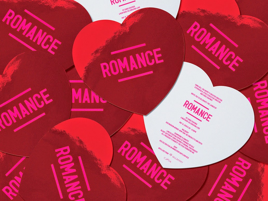

Luxury Packaging

Finally is luxury packaging that over the last few months I have come to realise that this is a main aspect I would like to progress with after leaving university. Packaging is something that I enjoy but when paired with high end and bespoke brands it becomes something I am really passionate about. I love the clean finish and use of colour and shape. As well as packaging I would also like to develop my skills in branding and editorial for this sector as well.


Aims

By future goals at the moment are quite vague but this is something I would like to cement down in the coming months. I would initially like to get a short term internship in a city that I am familiar with in order to get to grips with everything. Next would to graduate and be happy with what I have achieved over this time. During the summer and up to the start of 2015 I would like to gain some internships in new cities whether this be in the UK or abroad. After this travelling is something that I feel I have to do before any serious commitments come my way. And finally if all the rest goes to plan I would like to find a full time job in design, after having that time to find a city I would like to live in at a studio I am passionate about.

Friday 7 February 2014

Studio Visit - Elmwood.

As part of Elmwood's live brief 'brand the boring' a selection of students got chosen to take their pitch ideas and present them at the Elmwood studio in front of a couple of their designers. My idea was lucky enough to get selected along with six others. Initially I was very shocked as I hadn't expected it due to the high level of competition from others on the course, however I was also very excited.

It was arranged that we would meet as a group at the studio where we had a quick tour around the building. I was very surprised at how large it was inside as from the front it looked like quite a small space. I loved the large open spaces and how there was a variety of different spaces for people to work. On the walls and placed around were examples of previous work that was really interesting to see.

After looking around we moved to the conference room and took it in turns to present our boards and idea. I found surprisingly when it came to my turn that I wasn't as nervous as expected and I felt confident in what I was speaking about. I feel like this is because if the relaxed atmosphere and also due to the experience I have gained presenting from my time on the course. I felt that I spoke about my idea clearly and enthusiastically.

After each of us had finished there was a short discussion about our work, positives and improvements that could have been made. The feedback I received was that my overall theme was very strong and the unique quality would be very appropriate and exciting for the audience. It was also said that the supporting elements were very relevant and fit the fairground idea well. Some improvements that were suggested mostly revolved around the choice of type, as it was felt that it could have been more carefully considered.

Overall this was a hugely beneficial and exciting experience for me. Not only to be invited into an award winning international studio and to be able to see and experience where they work, but also to present my work to working professionals and get valid, helpful feedback. I found that this experience has given me confidence in that my work had be chosen for this stage and also that I can present confidently in front of new people.