"We describe ourselves as a design boutique. This reflects our small but beautiful size, our clientele and our dedication to the authentic, the specialist and the sophisticated.We are a design practice based in London our services include; branding, graphic design, copywriting, strategy and art direction."
Radiance Cleanse Juice
"Radiance Cleanse was founded in 2009 by two best friends, Christina Agnew and Clare Neill, who both believe passionately in the huge benefits of juice cleansing. Clare and Christina wanted to pioneer the UK's first high quality, nutritional and organic juice cleanse programme, and they wanted to make it available across the mainland UK. And so Radiance was born."
I love the simplicity of this design as it really lets the product speak for itself and highlights its natural properties. This approach works due the vibrant and engaging tones of the contents of the bottles. I like how the branding has continued the transparent and white theme as it creates an aesthetically consistent identity. This lends itself to the web design as the photographs are so vibrant and engaging. I love the quirky take on photography by introducing coloured backgrounds and props as it makes the brand memorable and gives a personality.
Claridges
"Construct’s extensive and ongoing design programme for this luxurious English institution expresses the hotel’s Art Deco heritage, timeless glamour, and uniquely attentive form of traditional English service. The new identity created by Construct is an evolution of the hotel's established identity: the crest has been redrawn and a refined version of the typeface SangBleu (Blue Blood) has been introduced for the logotype to express the hotel’s heritage with elegance and restraint. This refined identity is contrasted with a bold and opulent brand palette inspired by the hotel's architecture and features. The Art Deco-influenced palette includes strong black and white chevrons and geometric patterns, contrasted with a fresh jade colour inspired by the original Art Deco bathrooms in the hotel. Construct have already designed more than 200 applications for the hotel, from carrier bags to rocking horses, and menus to umbrellas. One item, the silk kimono for suite guests, has already been identified as an heirloom piece by Liberty and the V&A."
The colour of these designs is initially what drew me in as I love the bold contrast between the jade, black and white. I feel the use of such statement pattern exaggerated this as the contrast is even more prominent. Across the range there are slight variations but it still all links together due to the strong brand identity. The fact that it can be applied to so many aspects demonstrates how successful it is.
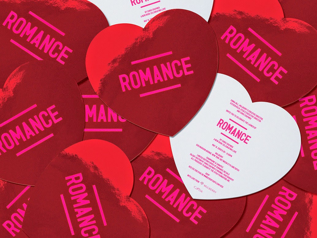
Romance
"Construct has collaborated on a number of publications with Mulberry, in particular 'Romance' with Chris Craymer and 'Glastonbury - Another Stage' with Venetia Dearden. 'Romance' is the culmination of an eight-year personal project by the New York-based British fashion photographer Chris Craymer. The couples featured in the book are sometimes models, sometimes not, but they are all real couples in varying stages of what Chris has described as ʻpre-mortgage love'. In collaboration with Mulberry, Construct was responsible for the book design and also marketing collateral and exhibitions, and for creating window display concepts. 'Glastonbury' documents some of the thousands of individuals who travel from all around the world to make up the vast and eclectic gathering that is Glastonbury. The pictures were shot at the festival over six years by the renowned photographer and regular Mulberry collaborator Venetia Dearden, and the book was designed by Construct."
The aesthetic of this collection is very interesting as even with the use of brown card and boxes that are usually associated with every day items the products still have a look of luxury. I feel this is due to the strong pink spot colour as it shocks the audience as it something very unusual to have with theses mundane items. This style has been carried out across all products and I especially like it with the black and white imagery.


No comments:
Post a Comment