- Hand rendered illustration
- Digital illustration
- Children's illustration
- Hand rendered type
- Digital type
- Retail Branding
- Screen print
- Book covers
- Publications
- Fashion editorial
- Food and drinks packaging
- Collage
- Photo montage
- Sport equipment branding
- Fashion advertising
- Paper craft
- Pattern design
- Textile design
- Magazine layout
- Album artwork
- Music promotion
- Music packaging
- Interior design
- Letterpress
- Embossing
- Mixed media
- Corporate identity
- Gift wrap
- Stationary
- Book binding
- Fashion illustration
- Advertising
- Window displays
- Web design
- Educational
- Motion graphics
- Animation
- Infographics
- Photography
- Decorative packaging
- Confectionary packaging
- Business cards
- Invitations
- Alcohol promotion
- Card design
- Wrapping paper
- Wallpaper design
- Quilling
- Experimental type
- Posters
- Independent work
- Music magazines
- Fashion magazines
Selected ten items

- Who is the client? Warren Ellis (author)
- Who is the intended audience? Potential readers of 'Gun Machine.' Fans of action crime novels.
- What is it's function? To promote the book and make people want to buy it. To put across the style of the book in order to attract the correct audience.
- What is the budget? Because Warren Ellis is an author of critical acclaim, this would suggest that the budget for this cover would be slightly higher than a less know writer. Although, book covers are also a mass produced item so the cost would also need to be low enough to print a lot cheaply.
- Where is it from? New York
- Who is the designer/studio? Oliver Munday

- Who is the client? Kaleid, arts and culture magazine
- Who is the intended audience? Readers of Kaleid
- What is it's function? To create an appealing design to put across the content.
- What is the budget? This publication focuses on fashion, arts and culture which are quite high brow topics and would suggest a higher budget than say something like a celebrity gossip magazine. It would also be quite a selected readership so less copies would need to be made, again suggesting a higher price.
- Where is it from? London
- Who is the designer/studio? Aidan Stonehouse

- Who is the client? Margaret Howell
- Who is the intended audience? High stature and longevity in the fashion industry, known as being the queen of minimalism, so men and women who know their stuff when it comes to fashion, who have money to spend. Her designs are known for being fundamentally masculine and are chosen by those who already know and love the brand. Margaret Howell doesn't try and compete with the high street, so high cost is to be expected.
- What is it's function? To promote and advertise Margaret Howell's designs, displaying pieces from her collection. It also has to represent what she is about, and what to expect from her line of clothing. It must express her love for minimalism, androgyny and sharp cuts.
- What is the budget? Venetia Scott has built up an extremely impressive portfolio, working for Vogue, i-D, Another Magazine, Dazed & Confused, A.P.C, Margaret Howell and even alongside Marc Jacobs. This mixed with the fact that Margaret Howell has had a strong presence in the fashion industry for nearly four decades, with what would be classed as a high quality brand, would lead to what would be assumed to be quite a high budget.
- Where is it from? British designer and photographer, both based in London.
- Who is the designer/studio? Margaret Howell clothing, Venetia Scott styling and photography.

- Who is the client? Comme des Garcons
- Who is the intended audience? Experimented with an avant-garde audience. Both men and women with a keen interest in the fashion industry, that are wanting to look good at a high price. Comme des Garcons is extremely popular amongst celebrities, including Mary-Kate Olson, Kanye West, Chloe Sevigny and Karl Lagerfeld.
- What is it's function? Not to just sell the brand, but also to sell the 'image' of the brand itself. It is there to portray the personality and thoughts behind the label.
- What is the budget? High end, high cost.
- Where is it from? Comme des Garcons based in both Tokyo and Paris. Total management based in both New York and Paris.
- Who is the designer/studio? Designer Comme des Garcons, studio Ronnie Cooke Newhouse – Stephen Wolstenholme from Total.

- Who is the client? Rob Ryan uses intricate paper cut to produce illustrative design. Rob ryan has worked for clients such as Vogue, Elle and Paul Smith. However he has also illustrated a number of books including, The book of lost things and The world to come. However in the piece of design above, the client could be for a card design company or just not independent work from the artist. Therefore sold for aesthetic reasons.
- Who is the intended audience? The delicate detail yet simple aesthetics suggests that this piece of design is aimed mainly at females. Also the imagery used such as flowers and birds are communicated in a very charming way which could be targeted at either a man or a women for their partner. The typography equally implies messages that are romantic and poetic. The bold red colour also gives the overall design as a graceful look suggesting that women would buy this piece of design on a mug, notebook, card or just to frame.
- What is its function? The function of this design is dependant on where is applied.
- What is the budget? Over the years, Rob Ryans designs have become increasingly popular therefore he is able to sell his work a high end price. As a lot of his design, like the one above, is very detailed paper cut. Therefore it would cost quite a lot to laser cut each design. It is also a time consuming process which would increase the budget further. Through research, purchasing a Rob Ryan laser cut could cost anything from £80.
- Where is it from? Rob Ryan's studio and main shop are based in East London. However the main selling point is from the online shop http://www.etsy.com/shop/misterrob. As Rob Ryan is based in London, all of his work is created in the Unite Kingdom however his work is sold internationally. The design showed above can be purchased from either of these places on different formats.
- Who is the designer/studio? Rob Ryan is the designer of this piece of work. Rob is a British artist who has mades a name for himself with his elaborative papercutting and screen printing.

- Who is the client? The audience the ones who they are producing work for as they will be the consumers who purchase but the clients don't have anyone to answer to respect to this piece and design it on the basis of personal choice and aesthetics.
- Who is the intended audience? Home owners/ 'great for both kids and kids at heart.'/owl lovers/people you appreciate handcraft/ people who appreciate vintage/modern print design.
- What is the function? To decorate the home interior.
- What is the budget? Low budget of recycled paper and non toxic inks.
- Where is it from? Online shop/Long Beach, CA studio.
- Who is the designer/studio? Sass & Peril - Shannon Kennedy & Cesar Fernandez.

- Who is the client? Jane Mayle - clothing company headed by model turned designer.
- Who is the intended audience? Young females who are into wearing high end fashion/people with expensive taste/fans of the models.
- What is the function? To label clothing/represent the clothing brand/to increase the quality of the brand/appear high end fashion/form an identity.
- What is the budget? Budget appears quite low, not a major famous company and only a few products were created to circulate across the brand including minimal packaging, clothing tags and a flyer.
- Where is it from? America - New York - Noho.
- Who is the designer/studio? David J Weissberg.

- Who is the client? She has worked for Boxfresh, doing their designs for TShirts and some packaging, however this particular piece is just a simple doodle from a moleskin notebook, It could well have been edited but it still has a hand rendered feel to it. She has also worked for The Big Issue, and Synergy.
- Who is the intended audience? The audience is broad, However it has more of a feminine feel to it, Many examples go her work have been targeted at children, however she has also worked for GotgotNeed, Helping to Produce Moving animation ,So its audience could be male or female, and any age.
- What is its function? Its function is to deliver a message through typography, it could be used on other products, in order to promote or advertise something. Or could be used in a more illustrative sense in Publishing.
- What is the budget? Very cheap budget, Particularly on this Specific piece, as it is simply on paper and it has been done in permeant market or colours pens.
- Where is it from? The Uk, but her work has a spanish influence to it, she uses a lot of spanish phases and singular words.
- Who is the designer/ Studio? Sophie Henson.
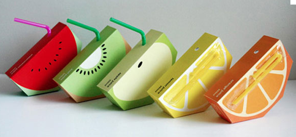
- Who is the client? Jooze is a fictional company that manufactures fresh fruit juice.
- Who is the intended audience? Its target audience is nursery and Primary school children, Or children in general.
- What is its function? To help promote healthy eating habits from a young age, within schools and nurseries, Packaging is entertaining and intriguing for younger children, it interacts with its audience.
- What is the budget? The packaging was never produce, as it was work done by a student for a fictional company, it was never mass produce, so budget will be small.
- Where is it from? Designed and made in Australia.
- Who is the designer/ Studio? Yunyeen Yong.

No comments:
Post a Comment